|
|
Post by Django Mathijsen on Jul 8, 2011 17:36:53 GMT -5
This cover was made by my girlfriend, Anaïd Haen, for her story "Ferk gaat op reis". Yep, that's Dutch, in case you were wondering. The title translates into English as "Ferk goes on a trip". It's a funny 3,000-word teleportation tale about Armon's boss Ferk who's afraid of traveling, but still wants to visit the exotic country of Rhubarbaria. Anaïd won the theme contest "traveling" from the Dutch magazine Pure Fantasy with it. Any comments on the cover?  |
|
|
|
Post by djmills on Jul 8, 2011 18:59:31 GMT -5
I have one suggestion.
Frame the book with a thin black line to stop the background of the cover from disappearing into the background of the web page.
Check out some of Dean Wesley Smith's white background covers. The small black border helps the cover stand out from the background.
|
|
|
|
Post by Django Mathijsen on Jul 9, 2011 8:14:21 GMT -5
Thanks. That’s an excellent suggestion.
|
|
|
|
Post by lvcabbie on Jul 9, 2011 9:39:05 GMT -5
I'm amazed at myself but I understood what it said in Dutch.
I used to be fluent in Deutsch.
|
|
|
|
Post by Mark Neumayer on Jul 9, 2011 10:55:42 GMT -5
Nice and professional looking. I would echo the suggestion for a thin line around the edge of the design to help it stand out on white backgrounds.
With the size of the picture you provided I am not totally sure what the curvy stuff is but it gives me a vibe of some sort of futuristic travel and that is enough to pique my interest.
|
|
|
|
Post by Django Mathijsen on Jul 20, 2011 17:04:49 GMT -5
I'm amazed at myself but I understood what it said in Dutch. I used to be fluent in Deutsch. Wow, that’s great. Yes, Dutch and Deutsch are quite close (although I’d never admit it… except in English).  |
|
|
|
Post by Django Mathijsen on Jul 20, 2011 17:06:50 GMT -5
Nice and professional looking. I would echo the suggestion for a thin line around the edge of the design to help it stand out on white backgrounds. With the size of the picture you provided I am not totally sure what the curvy stuff is but it gives me a vibe of some sort of futuristic travel and that is enough to pique my interest. The curvy stuff is Rhubarb. And the futuristic travel feel is exactly what Anaïd was going for. So: thanks, she’s very happy.  She used GIMP to create a new version. What do you think: is this one better? 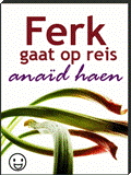 |
|
|
|
Post by edwinmason on Jul 21, 2011 14:52:40 GMT -5
I like the new one better. The change of font for the name sets it off quite well and it's readable. The black border makes it look like a book. But I'd get rid of the smiley face.
|
|
|
|
Post by Mark Neumayer on Jul 22, 2011 8:14:59 GMT -5
I didn't even notice the smiley face on the first cover. I would agree that it doesn't seem to fit, though, and that you don't need it.
But that is only my opinion and can be freely disregarded. ;D
|
|
|
|
Post by lvcabbie on Jul 23, 2011 9:22:04 GMT -5
I agree about dumping the smiley face.
|
|
|
|
Post by Django Mathijsen on Jul 24, 2011 6:30:10 GMT -5
Thanks very much, guys.
You're right. The smiley face (which was intended to be a genre icon) has been dumped.
|
|


